

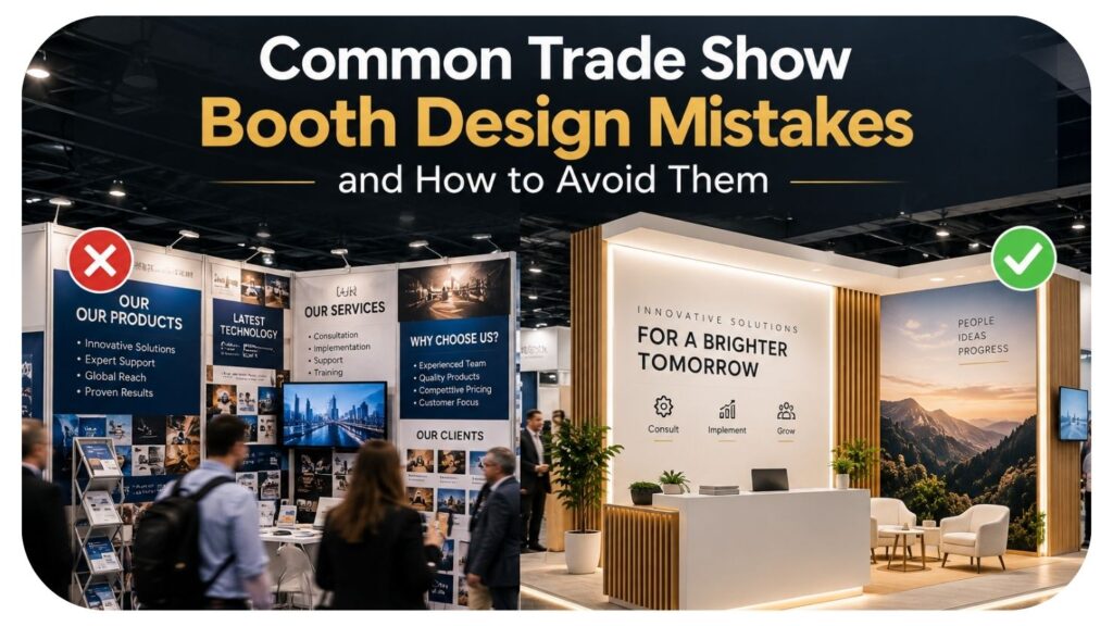
A trade show booth has only a few seconds to make an impression before attendees decide whether to stop or keep walking. That’s a tough window to work with, and it’s easy to see why so many exhibitors fall into the same design traps year after year. The frustrating part is that most of these mistakes aren’t about budget. They’re about planning, clarity, and understanding how people actually move through a show floor. Here’s a look at the most common booth design mistakes, and how to steer clear of them.
Cramming Too Much Into the Space
One of the most frequent mistakes exhibitors make is trying to showcase everything at once. Every product, every service, every accolade gets crammed onto signage and displays until the booth feels cluttered and overwhelming. Attendees walking by don’t have time to process a wall of information, so a crowded booth often reads as confusing rather than impressive. The fix is restraint. Pick one or two key messages you want people to walk away remembering, and let your visuals support that message clearly rather than competing with it. White space isn’t wasted space. It actually helps your most important messaging stand out instead of getting lost in the noise.
Ignoring Traffic Flow and Layout
Booth design isn’t just about what’s displayed. It’s about how people physically move through the space. A common mistake is placing tables, furniture, or displays in ways that accidentally create bottlenecks or make the booth feel closed off from the main aisle. If attendees have to awkwardly squeeze past staff or furniture just to get a closer look, many will simply avoid the booth altogether. Larger footprints bring their own challenges here. A 10 x 20 trade show booth, for example, offers plenty of room to work with, but that extra space needs intentional zoning for demos, conversations, and open walkways, or it can end up feeling empty and disorganized rather than spacious and inviting. Think through the visitor’s path before finalizing your layout, not after.
Weak or Unclear Branding
It’s surprisingly common to walk a show floor and struggle to figure out what a company actually does just by looking at their booth. Logos without context, vague taglines, or overly clever messaging that prioritizes cleverness over clarity can leave attendees confused rather than curious. Your booth should communicate who you are and what you offer within a few seconds, even from a distance down the aisle. Strong, simple messaging paired with clear visuals does more heavy lifting than an elaborate design ever will. If someone can’t explain what your company does after glancing at your booth for five seconds, the design needs more clarity, not more decoration.
Poor Lighting Choices
Lighting is one of the most overlooked elements of booth design, yet it dramatically affects how your space feels and how products are perceived. Relying solely on the convention center’s overhead lighting often results in a flat, uninviting booth that blends into the background. Harsh, poorly placed lighting can also wash out colors or create unflattering shadows on products and staff alike. Thoughtful lighting, whether through accent fixtures, backlit displays, or strategic spotlighting, draws the eye exactly where you want it to go. Even a modest lighting upgrade can make a booth look significantly more polished and professional without requiring a complete redesign.
Forgetting the Staff Experience
Booth design mistakes aren’t limited to visuals. Many exhibitors design spaces that look great but are uncomfortable or impractical for the staff working the booth all day. Missing storage for bags, jackets, or promotional materials, no space to sit during slower moments, and awkward counter heights for conversations can all wear down staff energy over a long show. Tired, uncomfortable staff are far less likely to engage attendees with enthusiasm. Design your booth with practical needs in mind, including storage, seating, and easy access to materials, so your team can focus on conversations rather than logistics.
Final Thoughts
Great booth design comes down to clarity, intentional layout, and a genuine understanding of how attendees experience a show floor. Avoiding clutter, planning traffic flow, sharpening your branding, and paying attention to lighting and staff comfort can transform a forgettable booth into one that actually draws a crowd. These fixes rarely require a bigger budget, just more thoughtful planning before the show begins. With the right approach, your booth can finally do the job it’s there for: stopping people in their tracks and starting real conversations.


Leave a Reply