Steps to Building a Dashboard in Excel
This post was last updated on November 28th, 2024

Are you interested in building dashboards? Discover how to create a dashboard in Excel in this post.
What Is a Dashboard?
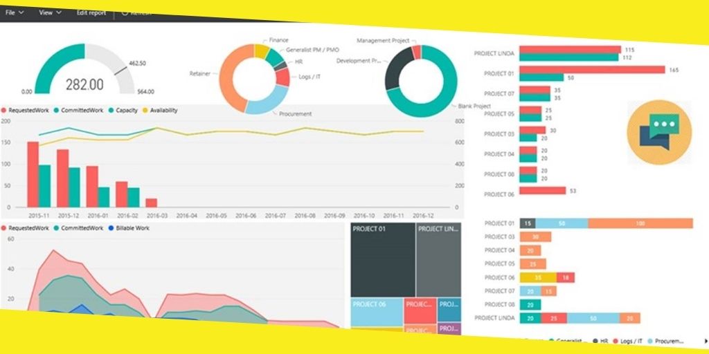
Excel Dashboard is a fantastic tool for tracking KPIs, metrics, and other data points into a single visual and central place. The dashboard gives you an elevated perspective on work. It helps in making decisions on time and staying up to date with the latest. You can streamline complex data and get a page overview of the current status with a dashboard.
Dashboards comprise tables, diagrams, illustrations, and numbers. You can use the dashboard in management, business, and any other industry. In fact on Internet you can find dashboard templates, designed for the different industries that can help you to visualize better your data.
Things to do before creating a dashboard
Before you start creating your dashboard, determine its purpose. Ask questions about the uses, data source, and capacities. You can see also samples of dashboard templates for inspiration.
You may make a model of the Excel dashboard on paper before using your computer. Draw boxes for every data type to get an idea of the format and add a rough draft of the type of diagrams you need to incorporate. The model will help you and the stakeholders understand the process before investing time and capital in the original dashboard.
Questions to ask yourself
What is the purpose of the dashboard?
The first thing to do is to ascertain and be clear on the purpose of the dashboard. Is it for disproving a hypothesis, or for a particular assignment, estimating business performance, or other goals? Understanding why you are creating the dashboard will help direct the design and data.
Do you need to track specific KPIs?
Your dashboard should comprise only valuable data. Ensure you understand the main KPIs and make the dashboard around those metrics. Whatever you input except those fundamental KPIs isn’t required.
Who needs the final output of the dashboard?
Consider the recipients of the dashboard while creating the dashboard. Input their preferences for clarity. Is it for a coworker, administrator, shareholder, external broker, or C-level manager?
What are your data sources?
Determine how and where your data come from. Will you gather the data manually or through automatic synchronization? Figure out the other methods to get data for your dashboard.
How recent do you want the dashboard?
Build the dashboard with the version you need and how frequently it will update. Do you want a weekly or monthly update, or does it have to show constantly refreshed data?
How to Design the Dashboard
Dashboard components
Choose the preferred components for the dashboard. You can select from static tables, pivot tables, dynamic graphs, Excel measure gadgets, or non-charting objects. Deciding the elements of your dashboard will help you gather related data and give you a sense of the design. Use dashboard templates to avoid missing any important components.
Dashboard background-color
What background color would you like for your dashboard? You may add color that improves the elements or incorporates them with the diagrams.
Upgrading the dashboard UI
Invest in building a dashboard that is easy to navigate and user-friendly. You could add progression to the design for simple navigation, add drop-down lists, add symbols to each diagram with auto-shape objects, or use freeze sheets to keep users from scrolling.
Utilizing PowerPoint and Excel
Your dashboard could likewise become interactive with PowerPoint. It requires the use of Macros or VBAs, the programming language used in Excel. Although it is a difficult process, it can become interactive if you add the graphs and other dashboard elements you create in Excel to PowerPoint.
Recommended For You
Top 5 Ways to Manage your Day Effectively for More Productivity
Most Inside
Most Inside offers high-quality recommendations and valuable updates to enhance all aspects of your life, providing premium guidance and enriching experiences.


