Brand New Look Of Google Logo – Is It Childish Or More Dramatic?

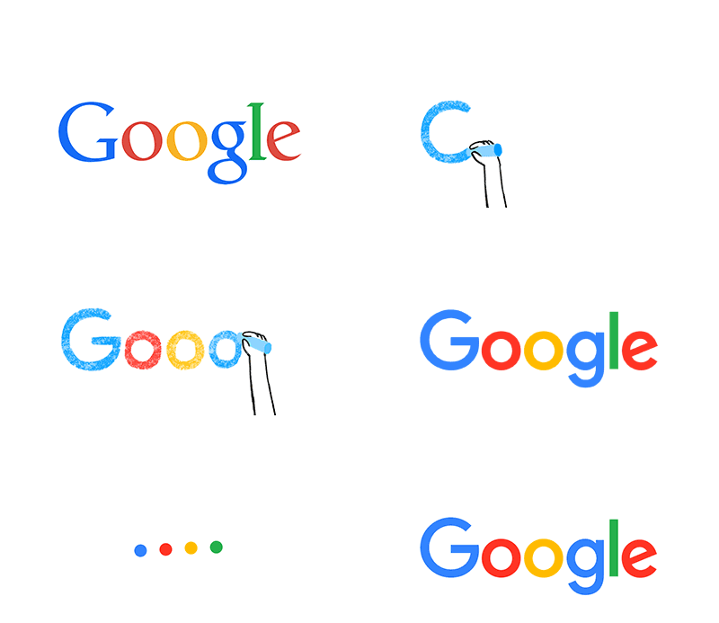
Oh! Wow! The new Google logo unveiled just a few days back is drawing all sorts of reactions. Some think it to be a bit more dramatic or too simplified; whereas many think that, it is just a childish revamp of the original.
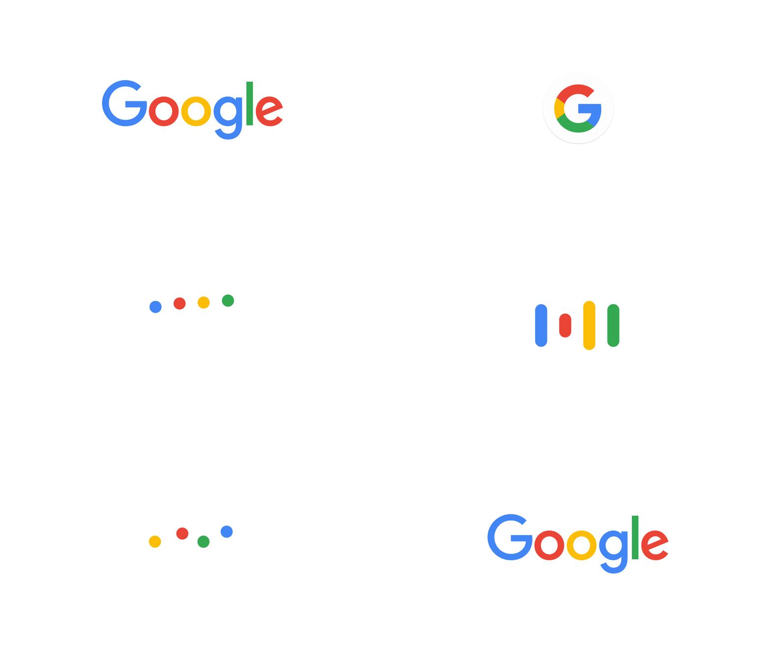
Surprisingly, as you keep on getting used to it, it seems to be more refreshing. Rather, creation of this new logo is a brave step to enhance its effect on the new multi-screen inter-web and the new four-color G icon incorporates all the four colors present in the Google logo.
What was the need to change the icon or the logo? After all, Google does not need much of the branding tactics to make it noticeable. It is already the most popular search engine, so surely no one can miss it. Right?
But the officials have a different perspective which justifies this makeover. The official statement from the Google says that the earlier logo as it evolved through the years was created solely for a single desktop browser page. Looking at today’s need for a seamless computing across endless devices and different kinds of inputs, for example talk, type and tap, change in the logo was the need of the time.
And here you have the best of the Google logo that is friendly, colorful, uncluttered and yes very much simple which increases its recall value. It is a design that is not only for the present, but also for the Google of the future.
Top 5 Reasons Why The New Google Design Makes More Sense
Experts consider this dramatic reshaping of the Google logo as the best effort since 1999 when the six letters ended with an exclamation almost similar to the Yahoo logo.
Here are the top 5 reasons why the new Google logo design is indeed worth appreciating.
-
It is Simple!
The launch of this new design is just perfectly timed and it does not come up as a mere coincidence. With the Mountain View Company undergoing restructuring into Alphabet, the new conglomerate of the tech firm, these changes are being looked upon as an essential strategy to keep Google separate from the other projects of the company.
Sergey Brin and Larry Page, the founders have pulled out several projects and divisions from Google Inc., and have added them as subsidiaries of the Alphabet. The aim is to form a slimmer Google portfolio so that the focus is more on Chrome, Maps, Android, Search and YouTube.
That can be the main reason behind the easy to see, easy to draw a new logo of Google that has less style but more substance.
-
Google is now Everywhere
Google has emerged as a cross-platform logo since past few years. You can see it everywhere. It was not the case almost two decades back when people were mostly into using a desktop PC.
According to Tamar Yehoshu , head of user experience, Google Inc., the search engine is now on tablets, smartphones, smart watches, cars, TVs and not just on computers. The new simplified look fits even the tiniest of the screens.
Moreover, when the microphone logo of Google pops up in the form of colorful mic icon it looks more simplified. Even with limited space, the multi-colored ‘G’ looks quite dominant and attracts attention.

-
Geometry Focused Language
Ever since the launch of Android 5.0 Lollipop and Google IO 2014, it has been trying hard to introduce geometry-focused Material Design language. The new logo realizes it fully. Because it is flat and do not have a special style, it gels with the simple interface of Google with polymer paper elements.
You will find most of the logos of the Google products and services either being refreshed or undergoing a change today. From Google News, Maps to Translate each respective logo comes with the white insignia in its corner. The Google+ has also donned the new avatar of ‘G’, although it has been treading behind in popularity since some time.
-
Non-Threatening and Bright
The bright colors of the new childish Google logo are non- threatening, exactly opposite to the menacing and dark working style of the company. The new friendly ‘G’ lessens the image of the company as a stern taskmaster and a producer of a Terminator.

-
Less Bytes
The new logo is a special variant with 305 bytes, much lesser than the earlier 14,000 bytes logo. Although it appears as a very small change compared to the gigabytes bandwidth of your mobile, for those using affordable data plans, it is a welcome change.
The lighter logo will help the company reach next billion people, especially in China and India, which is the biggest market for which the company has specially introduced Google IO 2015. The unveiling of new logo certainly is a part of it.
Check out this latest design roll out on the company products very soon.
Recommended For You
7 Reasons How Internet Customer Service Can Lift Your ISP Business
Sangati Jogwar
Sangati is a writer, poet, voracious book reader, singer, movie-buff and critic. Loves to discuss, interact and have a strong belief in spirituality.


